


Global Rhymes
Challenge
Solution
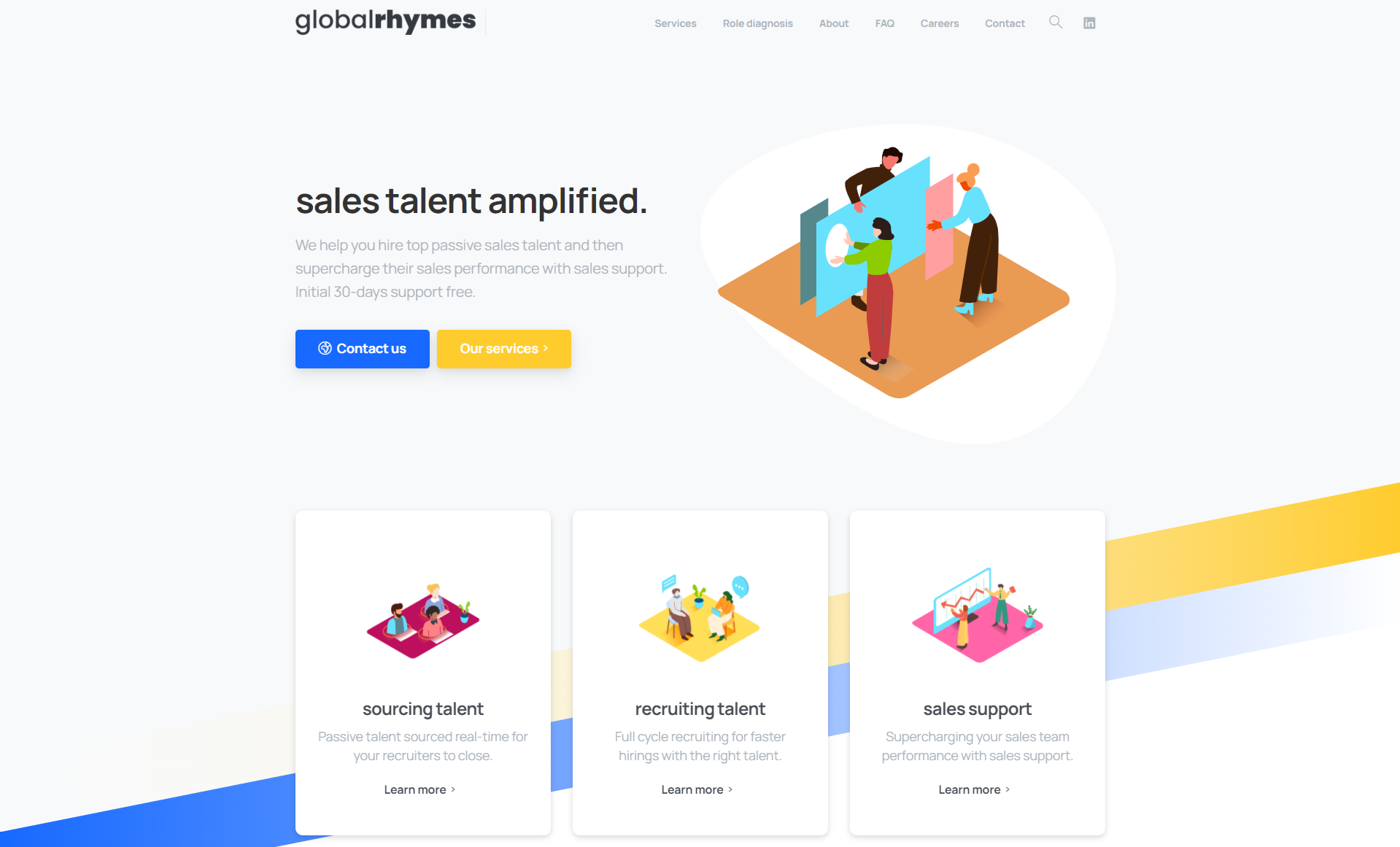
This was a project I worked on for Global Rhymes. We started with redesigning the brand. We decided to use a type-only wordmark logo, similar to brands such as Google or Sony, and many new startups following this trend. Wordmark logos reinforce the brand name, and many companies end up with poor graphic logos when going that direction. Sometimes it just doesn’t make sense. Continuing with this direction, we decided to scrap all stock photos and instead use minimalist illustrations to reinforce text sections. Stock photos can come across as tacky and cheap when there is no clear relation to the copy of the page. As for the website itself, we chose a design which would mirror the minimalist theme of the illustrations and new logo. We simplified the copy to reduce excessive detail and focus on how customers get value.
Client:
Global Rhymes
Date:
November 28, 2021