


Justin Pirk
Home
Justin Pirk’s website was designed to promote his brand. The site is running on updated software and using a simple, straightforward design. The user experience flows with certain points that provide a coherent narrative. The brand identity, colors, and font were consistent.
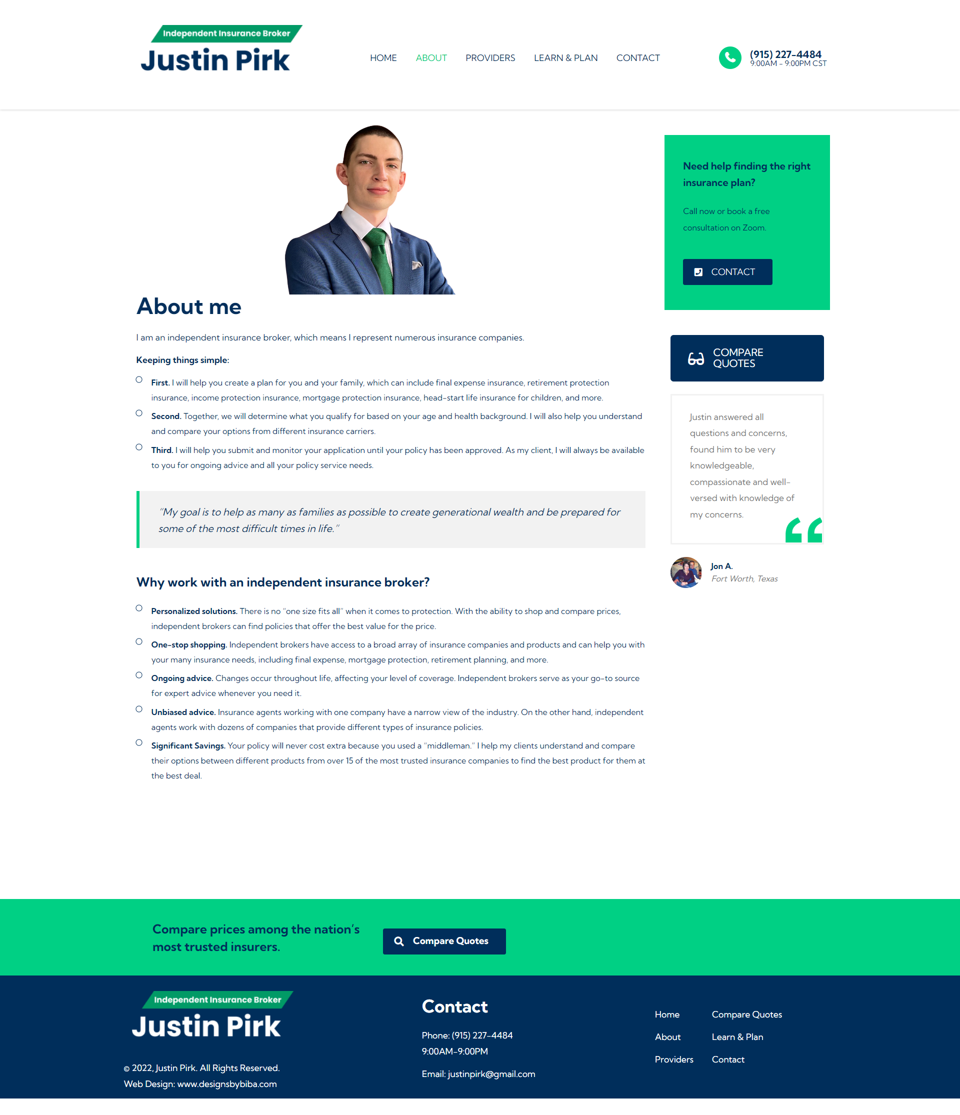
About
Information about Mr. Pirk, with the call of action being to push clients to compare quotes.
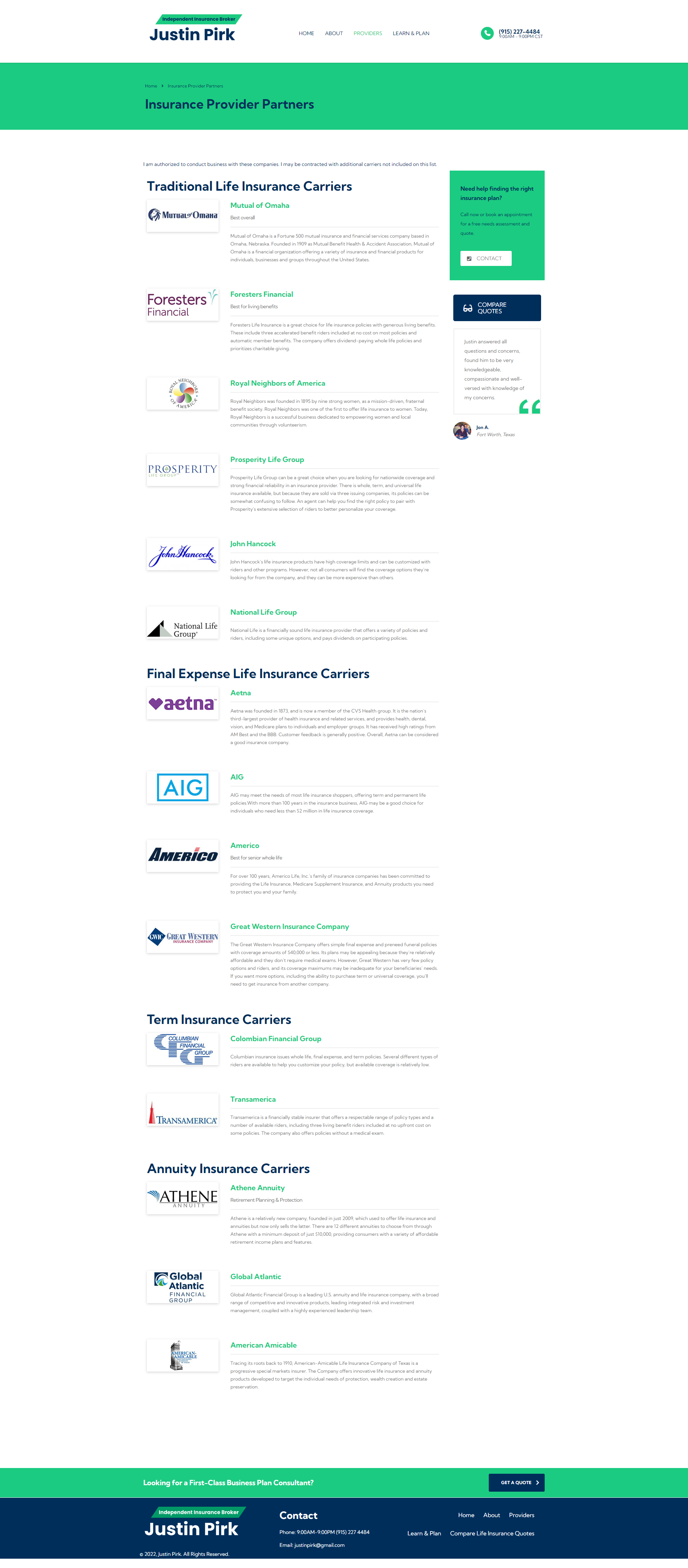
Providers
Different types of insurance, with the primary call to action being to push clients to book a consultation meeting.
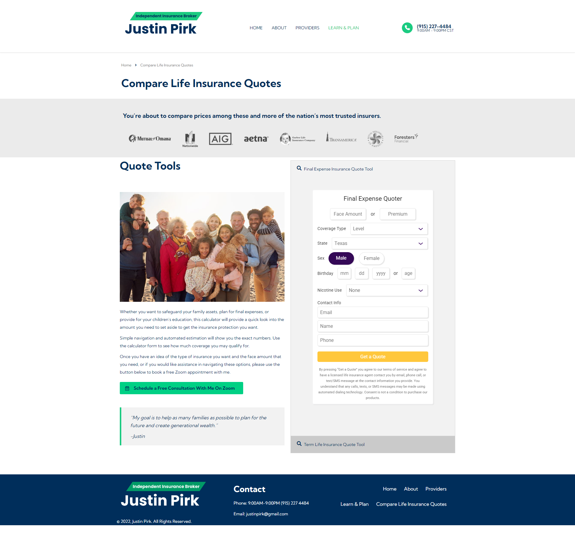
Quotes
Quote tool which allows clients to input their information and compare insurance quotes with different companies.
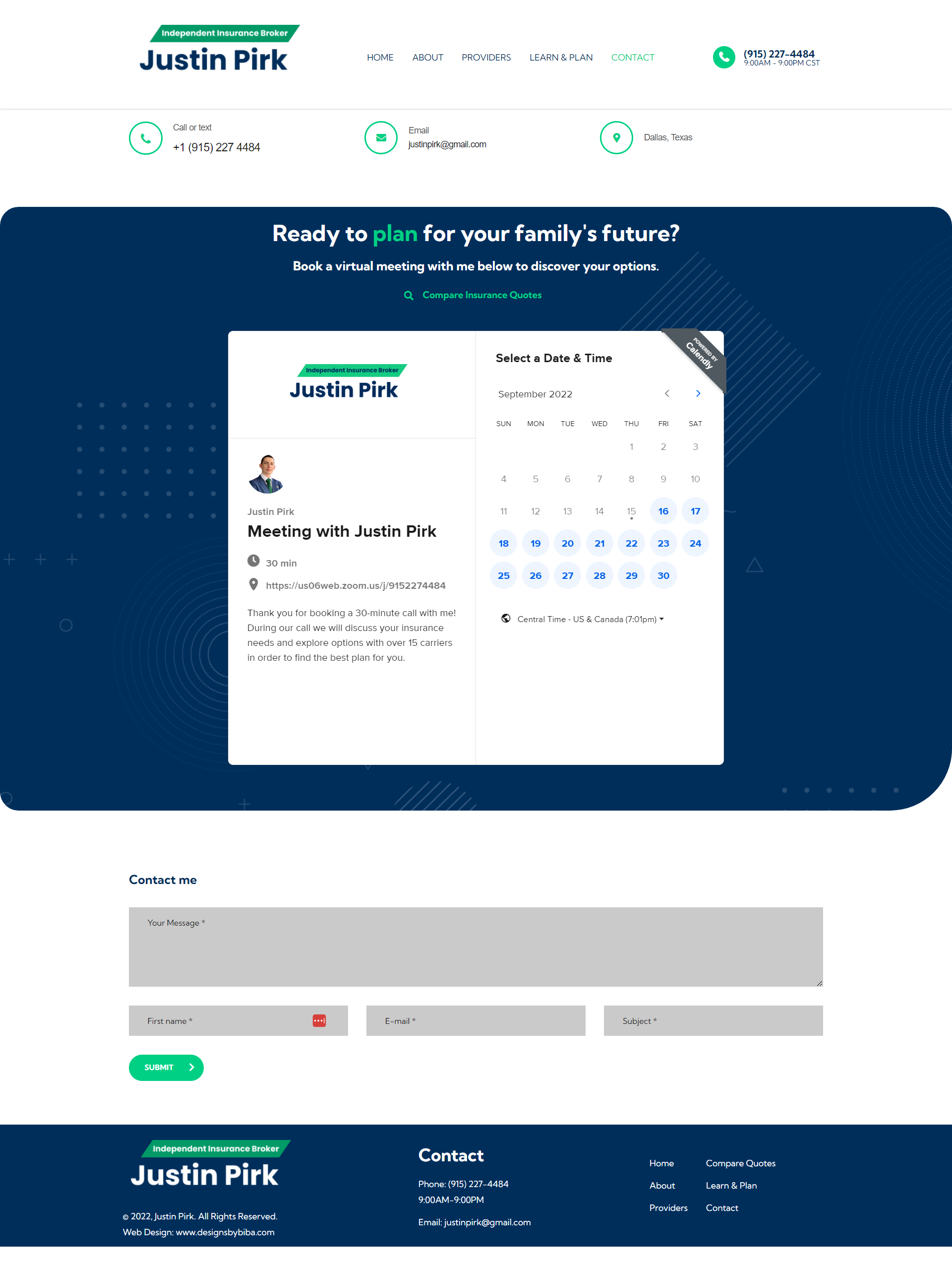
Contact
Calendar for clients to easily book consultation meetings on Zoom.
This was a project I developed for Mr. Pirk. I started designing the brand by working on his logo and I decided to use a type-only wordmark logo to showcase his brand. I ended up following in a direction that focuses on minimal style with animations that grabs the user’s attention. Experimenting with colors to provide contrast on certain sections that informs the users as quickly as possible. I chose a design that would mirror a no-fuss minimalist theme with simple colors and logo. I did not want to implement excessive detail to overwhelm the users and focus on how customers stay informed.
September 16, 2022